Inspiration
Reads
- Color Theory For Designers — Learn more about color theory and different color schemes types.
- The Psychology Of Color — Learn the meaning of each color.

April 15, 2021 - Reading time: 19 minutes
Color is everywhere. Working with color is an essential part of any brand, and a modern interface strives for its recognition. Therefore, choosing and using colors to achieve business goals can be challenging for any designer.
The choice you make affects the look and impacts how the customer feels about your product and business. Here are my practical tips on creating a bulletproof UI color scheme to help you make the right choice.
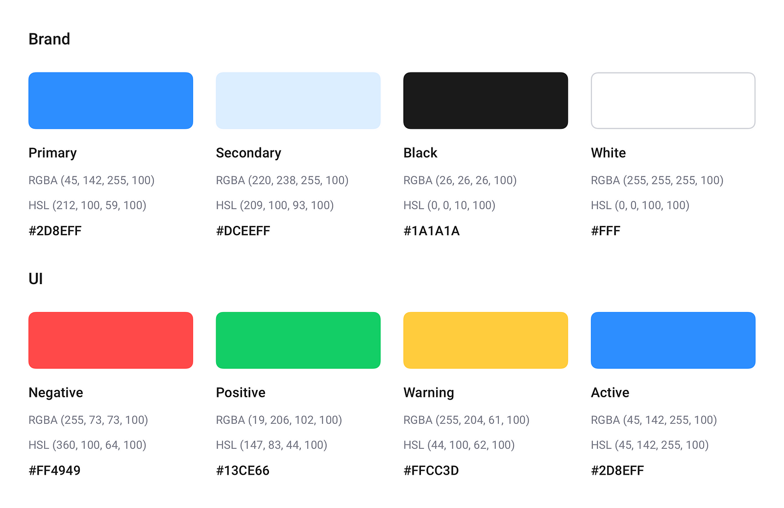
Define your primary colors.
The primary color is the first thing you should decide on.
The primary color is displayed most frequently across your screens and is used to point users to UI’s focal actions. Ideally, you should have 1 to 3 primary colors easily associated with your brand or product. That’s it.
Find your whites and blacks.
The only rule here is not to use an absolute white or black.
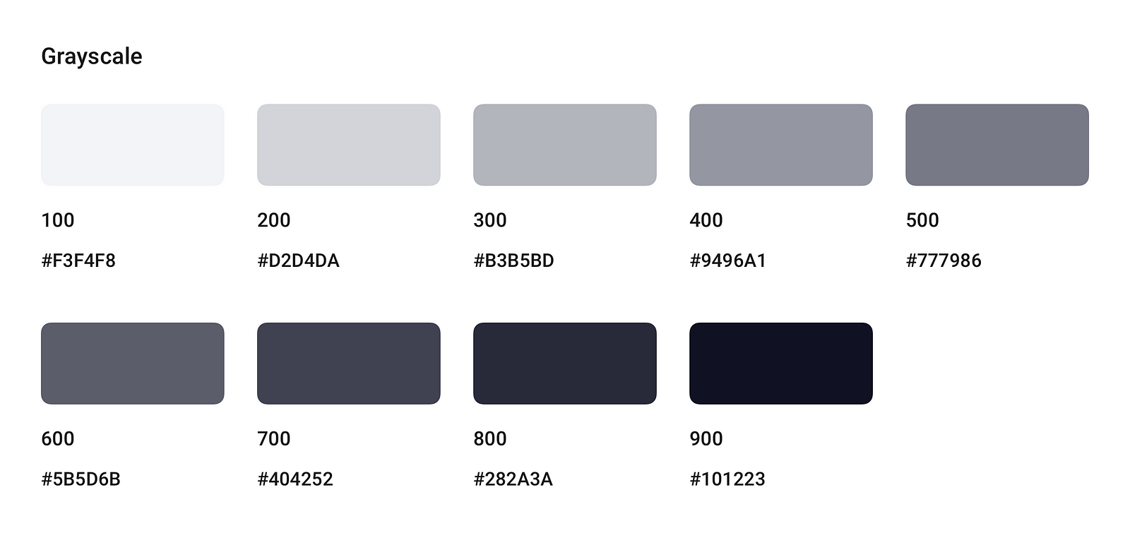
Absolute black and white colors can exhaust eyes when reading or performing actions. White (#FFF) has 100% color luminance, and black (#000) has 0%. Such an imparity makes intense contrast, which is harder for human eyes to adapt when navigating and reading.
Avoid using pure black on pure white, especially on larger areas. The best thing would be to use a limited grayscale palette made from neutral black colors with added white tints. Here is a quick sample you can apply in your projects:
Use the same accent colors.
Consistency is the key. Use the same color for both your links and buttons. By doing this, you will help users to spot interactive elements and perform actions seamlessly.
Use semantic colors to highlight important information.
Semantic colors — are colors used to signal user information about success, error, warning. Use semantic colors if you want:
This technique comes from real-world design, but it perfectly fits digital products. The 60% + 30% + 10% rule works because it brings the feel of balance and helps the eye move smoothly from one CTA area to another, guiding your user through the interface.
The rule is super simple and goes like this:
You can use these proportions to find the right balance when matching and combining your colors without turning your UI into a colorful mash.
It is considered that these proportions are pleasing to the human eye because they allow one to perceive interior design and your screen's overall composition easily.
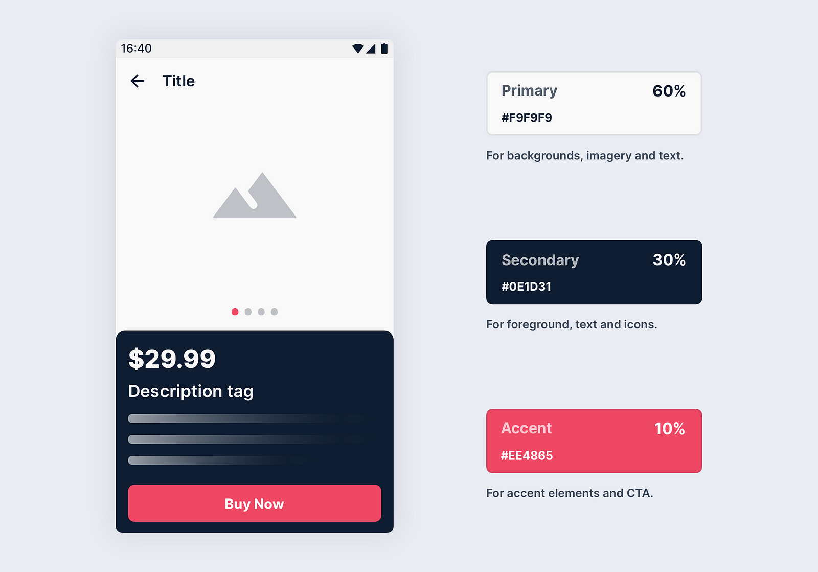
To better visualize, let us have a quick example with “60–30–10” in action:
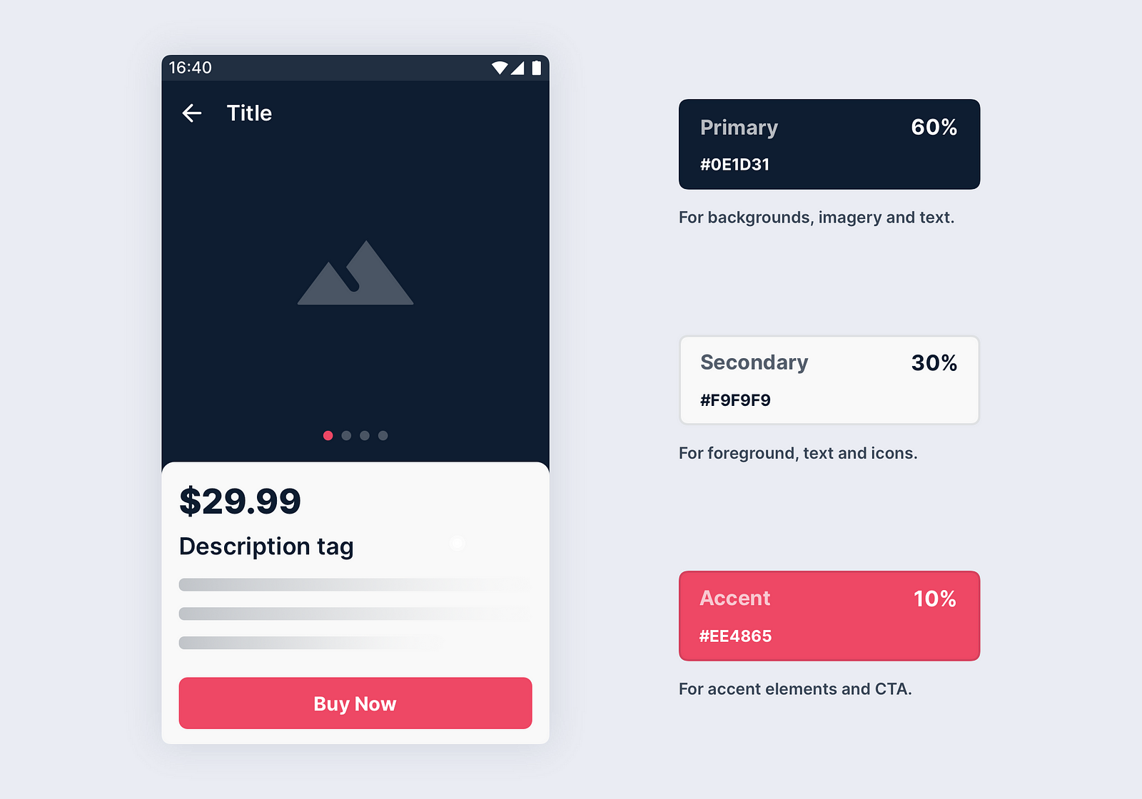
You can also apply colors in a different order, and it will still work. Wow!
The key to a good UX is understanding your audience.
Color plays an important role here, as your choice impacts the user's feelings and emotions when interacting with your product.
Therefore, when choosing a color, it is essential to ask and answer yourself the following questions:
These questions may and should affect your choice, so keep them rolling when choosing the UI palette and discussing your team's choices.
One of the very cool tricks is to use nature or architecture to inspire your unique color scheme.
There are plenty of tools on the web that can help you generate a color palette from an image. Here are my personal favorites you can easily use:
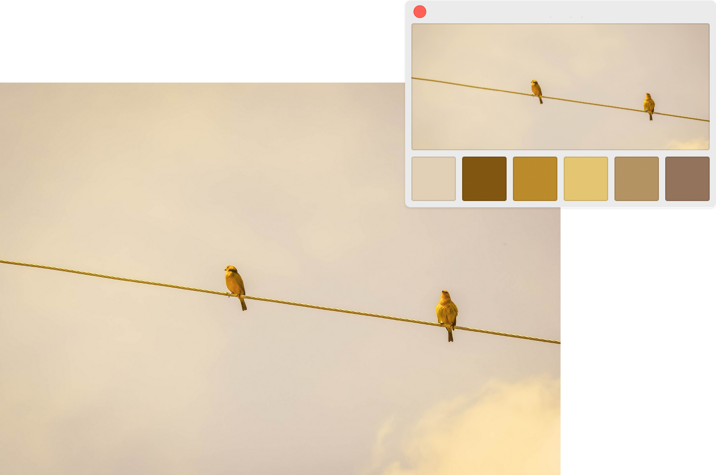
Have fun, and take inspiration from things you like.
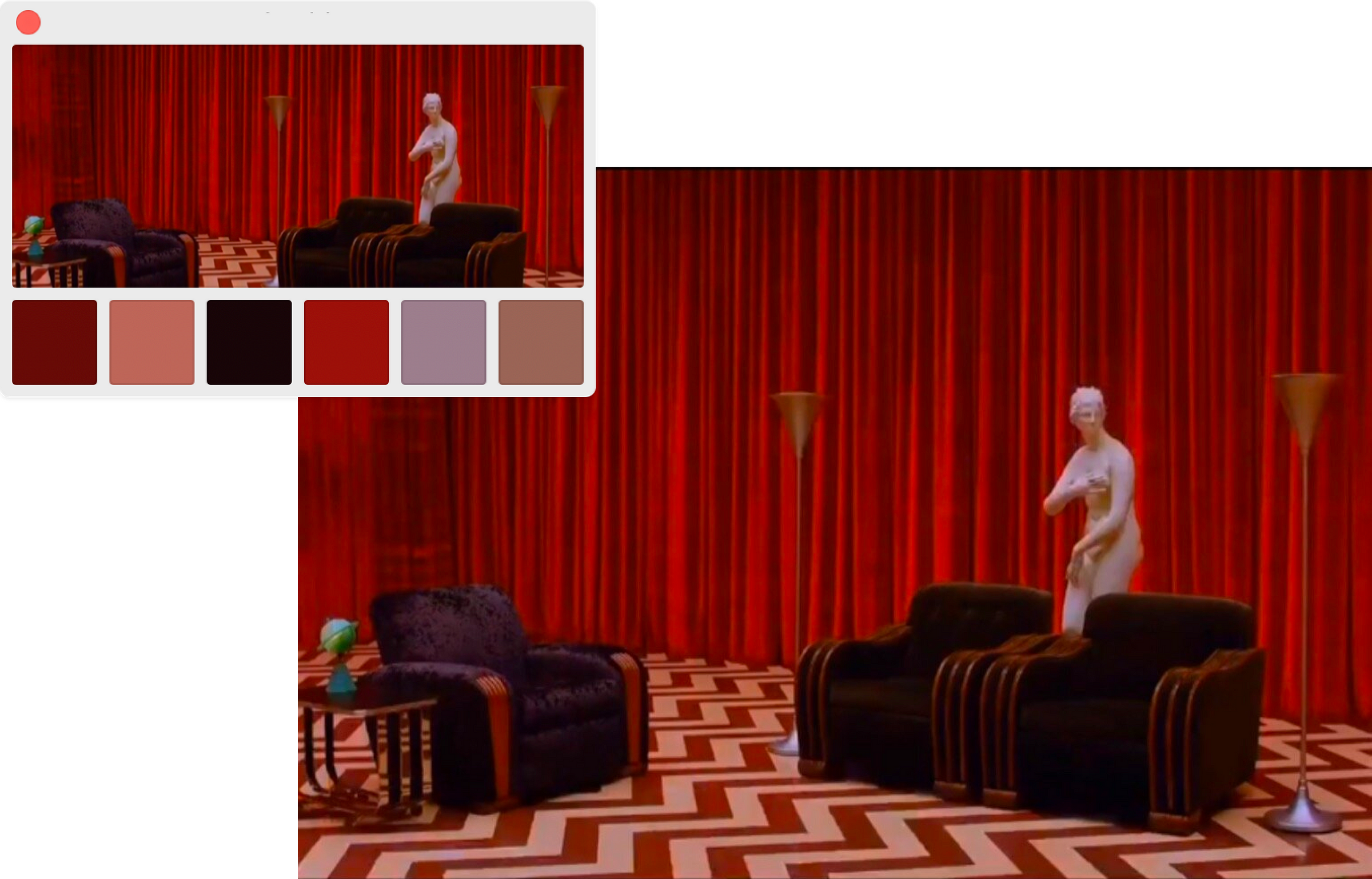
Use contrast based on your goals.
If you want to focus your user’s attention on a specific action, It’s a good idea to use high contrasting colors to help him find the focal point.
Such colors as blue, green, and red will quickly tell the context before the user reads the buttons’ text.
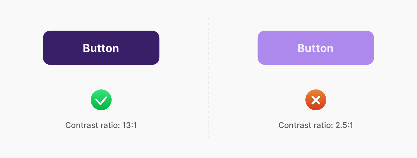
Contrast helps users to distinguish various text and non-text elements. Higher contrast makes the imagery more comfortable to see, and reducing contrast can give a more flat tone to images.
However, when dealing with UI design, a high contrast level can also be harmful if applied unwarily. If your text has too much contrast with the background, your UI will be harder to scan.
That why it's always a good idea to conduct a contrast check with the desaturation, evaluate the contrasting success, or just testing your design on different screens.
A tip to help you check the overall level of saturation with your designs.
Put a rectangle over your Frame or Artboard, click on show/hide through the night, to check and match your colors' overall contrast with your eagle eye. See if colors have or not the same level of saturation gamma.
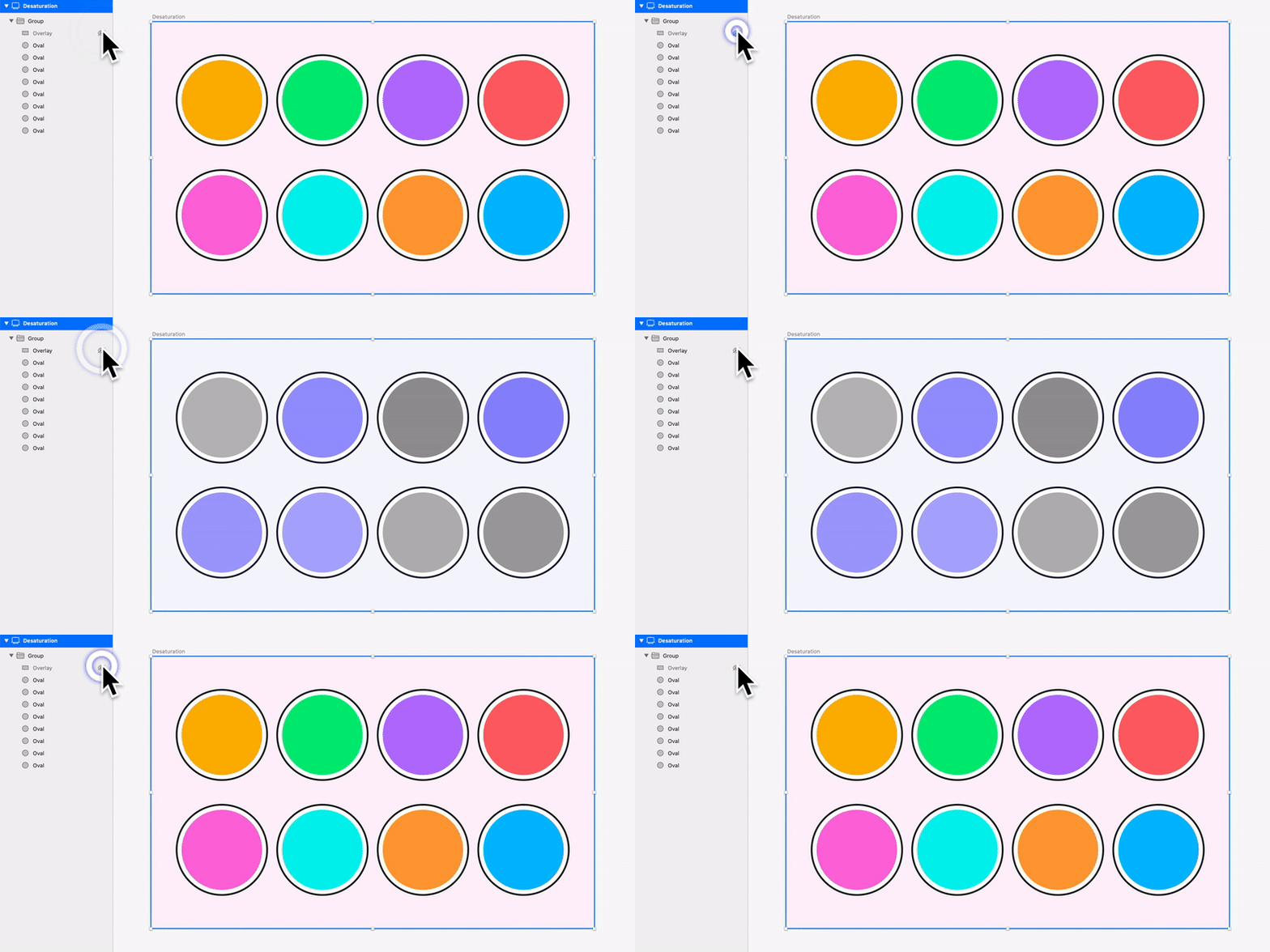
Put a #000 layer with Saturation fill over your colors. Check your color's saturation pattern. See something no one else can see.

As a designer, you have to take care of your users, especially when working with color, since not all people perceive it in the same. According to recent research, about 285 million people worldwide are visually impaired: blind or suffering from other vision impairments.
So here are a few tips to keep in mind when designing digital products:
When using your colors within a design system, always provide an exact name for each color. Every member of your team should understand names without the additional hustle and easily refer to a specific color within the product.
Avoid using a color gradation in names such as Light Blue or Darker Blue. Instead, use functional words that best describe the color in UI purpose. e.g., Positive, Warning, Active, Primary-Blue.
